
January 2021 saw the beginning of a new Journal Quilt Challenge for Contemporary Quilt members. The brief was a little different from usual: no set theme, size or shape, but all 12 Journal Quilts had to be linked together to work as a single quilt. To complete the challenge fully and qualify for a CQ Newsletter review and possible inclusion in the CQ gallery at FOQ, the makers were asked to email submission photos of their joined-up Journal Quilts and a favourite quilt from the whole, with a personal statement.
119 members signed up for the challenge. 50 completed their joined-up quilts and emailed their entries as requested. All these submissions were sent to our jurors. As Journal Quilt Coordinator, I could see that, as always, the standard was extremely high. Lots of strong design, striking colour choices, beautiful workmanship, and some very inventive ‘joinings’.
Popular themes included Nature, especially leaves and trees, the effect of the seasons, and places where it was possible to get away from the stresses and strains of life. An overlapping set of themes might be described as ways to cope with Covid and the beginnings of ‘normality’. Several quilters depicted walks in the countryside, park or nature reserve. A couple of the Journal Quilts featured historical photographs, another was a cartoon strip. There were also several abstract imagery quilts, often focused more on the fabric used or the design and stitch techniques employed than on a representational image.

A wide range of different materials were used– not only cottons, silk, felt and wool, but also non-woven stabilisers, various papers, tea-bag paper, silk paper, beads, buttons and melted bubble wrap! Techniques listed included dyeing, discharge, printing, painting, collage, wet felting, needle felting, appliqué and, of course, machine and hand stitch and quilting.

Many of the joined-up Journal Quilts were stitched together by hand or machine or to a layer of fabric, either as an invisible backing or an additional quilt element. Others were joined with tapes, netting, plastic sheet, wire, metal links or beads.
Shapes of the individual Journal Quilts ranged from regular squares, rectangles, hexagons and circles, through to cunningly contrived ‘jigsaw’ pieces. The ultimate joined-up shapes include rectangular quilts, strips and rows, concertina and fold-out books, a set of flags, irregular landscapes/maps, a kimono, and ‘ball’ and ‘star’ dodecahedrons.


nmvlckjnlnb

Later in January, two experienced quilt judges, Penny Bicknell and Suzanne Boulter, were asked to review the 50 joined-up Journal Quilt submissions. When all entries were of such high quality, it was not an easy task to select those for display at FOQ. The judges considered a photo of each joined-up collection and a component Journal Quilt, along with a brief maker’s statement about inspiration and techniques. All were judged anonymously.

Space in the CQ gallery being limited, jurors could only select a top ten and ten reserves. In the end, the first group comprised 11 Journal Quilts; alphabetically, these are by Megan Barley, Janette Bell, Jean Boath, Jill Brennan, Tricia Dickson, Maria Fox, Jill Packer, Lucy Paton, Hilary Richardson, Sabi Westoby and Margaret Wilmore.

The reserve group, for The Festival of Quilts, if space permits, included quilts by Connie Graham, Annie Henderson-Begg, Liz Howlett, Karen Hurrell, Dee Nicholson, Sue O’Riordan, Margaret Ramsay, Jane Varrall, Karen Ziadeh, and my own JQ*.

gfhnjgf
Juror’s comments:
“These collections of 12 mini quilts formed into single units give a wonderful insight into the amazing pool of talent that forms the Contemporary Quilt. These pieces represent the work of artists across the country working in various media to produce striking work.
In our selection, we have looked for the unusual, whether in fabrics, stitch, construction, or subject matter. It is intended to show a flavour of the work offered. The pieces illustrate the skills and imagination of the makers, inspiring the viewer to question: how was it done, what are the fabrics, why was that done like that?
These quilts are presented in differing shapes and forms. Fragility Pushes Through by Jill Rose Brennan shows great imagination in its construction as a kimono, whilst the interlocking nature of My Year 2021 by Hilary Richardson and The Lifebelt by Karen Hurrell offer alternative options. The monthly pieces worked well as books, such as How I go to the Woods by Margaret Wilmore, and Maria Fox’s leaves and Sketchquilts by Glenys Davies*.
The imagery of Fishwives: A Life by the Sea by Janette Bell, was striking, with embellishment, stitching and added text. Two into One by Jill Packer was joined together in an unusual and interesting way, showing her choice of fibre, stitch and variety of techniques.
This is an interesting exhibition with delightful works of art to stimulate the viewer. There is a surfeit of techniques to investigate and fibres to consider. We would encourage anyone with an interest in textiles to view this selection of work.”

Any selection must leave out some really good work, but hopefully this will not deter anyone from future Journal Quilt making. On a personal note, as Journal Quilt Co-ordinator, I really enjoyed looking at all the entries and reading the varied and interesting inspiration information – congratulations, and thank you to everyone who took part!

Read on for the first eleven selected Joined-up Journal Quilt Artist’s Statements. Do come and explore these, together with many of the reserve Journal Quilts, in the CQ Gallery at The Festival of Quilts this year!
Text taken from two articles by Glenys Davies in CQ’s Newsletters of March and June 2022
‘Two into One’ – Jill Packer
During a lockdown ‘sort out’ I had found two textiles from some years before; now was the time to use them. There was a dark faux felt, made on a workshop with Australian Gillian Hand. Thin layers of silk and wool tops, together with threads and cords, were laid onto a fabric backing. This was stencilled, covered with cold water soluble film and densely free machined over; film dissolved, it was pinned out to dry. The ‘gold’ piece was from a Barbara Barnes ‘Texture’ workshop. A variety of cottons, silks, linens, velvets and satins were layered, stitched and cut through to revealing the different textures. The whole was then tray-dyed with Procion dye, resulting in a different shade for each fabric. I cut these two pieces into different shapes and embellished them with beads, embroidery and covered washers.
‘A Leaf Through the Seasons’ – Jean Boath
Having always loved nature, my favourite walks are in woods. Picking up autumn leaves is a joy so, when the JQ challenge was announced, I wanted to base my design on my favourite leaf, from a Sessile Oak, native to Europe. I made a template from a real leaf then cut out backgrounds in the colours of the seasons. After texturing using torn scraps of material, melted bubble wrap, silk paper and manipulation, I added embroidered insects. I researched what insects were attracted to the oak and the months one could see them. The leaves are joined in a circle on a marbled background with a woven spider’s web sewn on top.
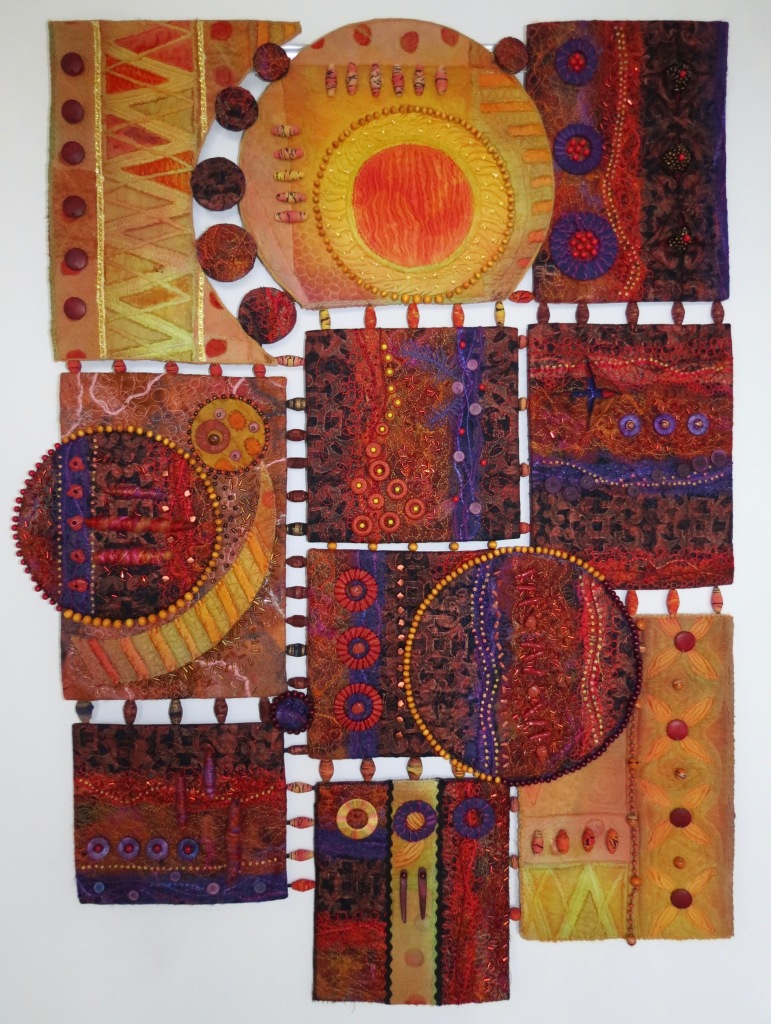
‘Rust and Circles’ – Megan Barley
The inspiration was beautiful rust dyed fabric produced by Tracy Fox. Twelve pieces were cut to shape then layered with wadding and backing. Various size circles were added to each. I began to machine and hand stitch the first piece, thinking about how the stitching would link to the other sections. Lines meandered around all the pieces; some circles were embellished with stronger designs. A canvas was made, covered with blue fabric, and finished with a wooden frame. A large quilting stitch attached the pieces; areas free of other stitching were quilted in the same way. From a distance, the main focus is Tracy’s fabric; as you get nearer, the more subtle stitching becomes apparent.
‘Fishwife: A Life by the Sea’ – Janette Bell
I enjoy exploring women’s lives in the past through old photos, and my 2021 journal quilts were inspired by antique photos of fishwives. Up and down the UK, they were often photographed and written about; I wanted to get across a sense of what I read – feisty women, tough and hardworking, but also relatively independent compared to many of their contemporaries because they earned their own money. Occasionally – as with the Newhaven fishwives of Edinburgh – they could even capture the public imagination and seem quite romantic figures. Interspersed are four scrappy quilted sea scenes. The photographs were reproduced on printable fabric using images in the public domain, then machine appliquéd onto scrappy quilting bases with hand embroidery details. The final quilt also includes a camera, to reflect how these women were observed as curiosities during their lifetimes and to acknowledge that, in re-using these images, maybe I am also guilty of attaching an unreal romanticism to their lives.
‘Fruit Salad’ – Lucy Paton
I started with a photograph I had taken, divided into 12. My intention was to treat each month’s section in a different way, with as many different techniques as possible. I have used Inktense blocks and crayons; mono-printed and painted with dyes, inks, acrylics and bleach; breakdown printing, stencils and screen-printing; hand and machine stitching; appliqué and used a heat gun and pigment pen. Fabrics included cotton, silk, Tyvek, sheers, textured material, wool roving, and felt. It was definitely a case of playing.
‘Islands of the South Atlantic Ocean’ – Tricia Dickson
My inspiration came from photos I had taken during the time I was lucky enough to work and live on Ascension, St Helena and Tristan da Cunha islands. Materials include: white cotton, creative soluble film, Lutradur, cotton and embroidery threads, Xpandaprint, Inktense blocks/pencils and acrylic paint. Techniques include: photo manipulation with Photoshop, hand sketching and printing, appliqué, painting and dyeing, and both hand and machine stitching.
‘Fragility Pushes Through’ – Jill Brennan
‘I took a theme of Regeneration and Renewal. This came from living in the city, with small wild areas being fenced off and then built upon – but even then, there are signs of nature pushing through, fragile but stronger than we think. I’ve been intrigued by kimonos for a while so I decided to try to display this as the back of a kimono. There are some words along the lower edge which are only just visible. They read ‘Crushed, the small shoot of fragility pushes through. Gently repaired with gold. It strengthens and becomes glorious beauty’.’
‘Concertina Book’ – Maria Fox
My concertina booklet shows leaves on both sides, the theme being leaves from my garden during year two of the pandemic. I chose to try different techniques including sun printing, collage, photo printing, printing on paper and fabric. It was my first collage and I thoroughly enjoyed the experience.
‘My Year 2021’ – Hilary Richardson
Inspired by Andy Goldsworthy’s ice and snow sculptures, I decided to use these ideas, but with each piece representing a month. Some are images from the garden; others depict dates or events. All are stitched together by fagoting.
‘A Year of Reactions’ – Sabi Westoby
The inspiration was Covid 19 – or more precisely, my sketchbook, started in November 2020 in response to the pandemic as the country headed towards the third lockdown. Pages were freely painted, colours overlaid and marks made. Circles became a recurrent theme, representing home as both a refuge and a prison for me whilst shielding. I interpreted some pages onto textile for my JQs. All but one incorporates handwriting and each has a title – top row from left: The Virus is Raging; Rule of Six; Three Word Slogan; Isolation, Quarantine. Middle row: Touch Me, Hold Me; Use Your Judgment; Support Bubbles; Families Divided. Bottom row: Mixed Messages; Stay Safe; Diary Page; The Light at the End of the Tunnel. Fabrics painted with acrylics; marks and writing made with fluid acrylics and finished with hand or machine stitch.
‘How I go to the Woods’ – Margaret Wilmore
‘My inspiration for the 2021 JQ challenge is Mary Oliver’s poem, ‘How I go to the Woods‘, in which she describes her desire to be alone while appreciating the joy of the natural world. I have worked from my own photographs printed onto inkjet fabric cotton sheets and organza. Photographs of textures have been manipulated and blended with other images to achieve the desired effects.’
*Glenys Davies’ Journal Quilt was featured in the July e-Newsletter.
